English Font: A Web Designer’s Layout Test
There is always that specific moment in a web design project when the wireframes are solid, the color palette is approved, but the personality just isn't landing. I was recently working on a rebrand for a boutique ceramics studio, and we hit this exact wall. The layout was clean and functional, but it felt sterile. The client wanted something that evoked heritage and craftsmanship without looking like a dusty museum archive. That was when I decided to test English, a vintage lettering font that promised the perfect balance of nostalgia and digital clarity.
As a UI designer, I am often skeptical of script fonts. They can be notoriously difficult to render on screens, frequently sacrificing readability for flair. However, integrating English into the hero section of the ceramics site changed the entire trajectory of the project. It wasn't just about making things look pretty; it was about establishing an immediate emotional connection with the user before they even scrolled past the fold. This typeface brought a tactile quality to the screen that standard sans serif fonts simply could not achieve.
Evaluating Digital Readability in Hero Sections
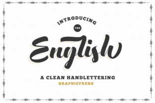
The first place I tested English was the main headline. In web design, the hero section has roughly three seconds to communicate value and vibe. I set the primary heading in English at a large scale against a muted clay-colored background. The immediate observation was how the letterforms held up at high resolution. Unlike many decorative fonts that become jagged or blurry on modern displays, the curves remained smooth and intentional.
What stood out most during this testing phase was the spacing. Vintage lettering often suffers from tight kerning that makes words bleed together on smaller screens. English, however, has generous internal spacing that allows each character to breathe. This is critical for mobile responsiveness. When I resized the browser window to simulate an iPhone view, the headline scaled down gracefully without becoming an illegible blob. For any digital product creator building responsive layouts, this inherent legibility is a massive time-saver.
Establishing Visual Hierarchy and Scanning Behavior
We tend to think of typography as purely aesthetic, but it is actually a navigation tool. Users do not read websites; they scan them. Using English as a display font created natural anchor points throughout the page. Because the typeface has such a distinct silhouette compared to the body copy, users could instantly identify section breaks and key value propositions.
- Hero Titles: The font works best at 48px and above, allowing the vintage details to remain crisp.
- Section Headers: Effective for breaking up long-form content on blog posts or course sales pages.
- Pull Quotes: Adds editorial weight to testimonials or featured snippets.
- Logo Lockups: Provides a custom, hand-lettered feel without hiring a lettering artist.
I found that using English for subheads or button text was less effective. The intricate details of the vintage style get lost at small sizes, and accessibility standards require higher contrast and simpler forms for interactive elements. Keeping English reserved for high-impact areas ensured it retained its power as a premium font choice rather than becoming visual noise.
Strategic Font Pairing for Modern Interfaces
A script font cannot exist in a vacuum. To make English work within a functional website, pairing it correctly was non-negotiable. The goal was to let the vintage typeface shine while ensuring the user experience remained frictionless. I opted for a neutral, geometric sans serif for all body copy, navigation menus, and footer links.
This contrast is essential. The organic, flowing lines of English played beautifully against the rigid structure of the sans serif. It created a tension that felt modern rather than dated. If you are designing a coaching website or a portfolio, consider pairing English with a sophisticated serif font for secondary headings to create a more editorial, magazine-like identity. Just ensure there is enough distinction between the three typefaces so the hierarchy remains clear. The rule of thumb I followed was simple: English provides the emotion, while the supporting typeface provides the information.
Application Across Digital Touchpoints
Beyond the main website, English proved versatile across various digital assets. We used it for email newsletter headers to maintain brand consistency in the inbox. On social media graphics, particularly Instagram carousels and Pinterest pins, the font acted as a scroll-stopper. Its distinctive character shapes are recognizable even in thumbnail size, which helps build brand recall over time.
For the online shop banners, we utilized English to highlight seasonal collections. The vintage aesthetic signaled "limited edition" and "handmade" more effectively than any badge or icon could. This demonstrates how typography influences perceived value. When users see a carefully chosen typeface like English, they subconsciously attribute that level of care to the products themselves. It builds trust through design competence.
Technical Considerations for Web Implementation
Before committing to English for a live project, there are practical technical checks every web designer must perform. First, verify the file formats. For web use, WOFF2 is the gold standard for performance. Ensure the font package includes web-ready files to avoid slow load times that hurt SEO and user retention.
Licensing is another critical factor. Always confirm that your license covers web embedding, especially for commercial projects like e-commerce stores or client sites. Some licenses differentiate between desktop use (for creating static images) and webfont use (for rendering text via CSS). Additionally, check for multilingual support if your brand serves a global audience. Missing glyphs can break the immersive experience instantly.
- Check OpenType Features: Look for swashes, alternates, or ligatures that can add variety to repeated headings.
- Test Contrast Ratios: Vintage fonts often have thin strokes; ensure they meet WCAG guidelines against your chosen background colors.
- Verify Mobile Rendering: Test on actual devices, not just browser resizing, to check for anti-aliasing issues.
- Review Fallback Stacks: Define appropriate generic fallbacks in your CSS in case the webfont fails to load.
Enhancing Brand Identity Through Typography
Ultimately, choosing English was about more than just filling a text box. It was a strategic decision to align the digital interface with the physical reality of the brand. In an era where AI-generated content and template-based designs are ubiquitous, human-centric typography stands out. The slight imperfections and rhythmic flow of vintage lettering remind users that there are real people behind the screen.
Whether you are building a course sales page that needs to feel personal, a portfolio that requires artistic flair, or a boutique store aiming for timeless appeal, English offers a robust solution. It bridges the gap between old-world charm and new-world usability. As designers, our job is to facilitate connection, and sometimes the right typeface is the most direct path to achieving that. By treating typography as a core component of UX rather than mere decoration, we create digital experiences that resonate deeply and perform effectively.